Packaging project :
Rupert's Fine Teas
Discover Rupert's Fine Teas' exquisite organic orange pekoe tea, brimming with flavour and heritage. This revitalized brand aims to highlight the sensory journey of tea through its packaging. It invites customers to fully engage with the taste, aroma, strength, and of the ingredients from the discovery of the packaging from the onset. In this exploration, we delve into essence of tea leaves themselves to the brew.
Mood Board


Concept in 2D
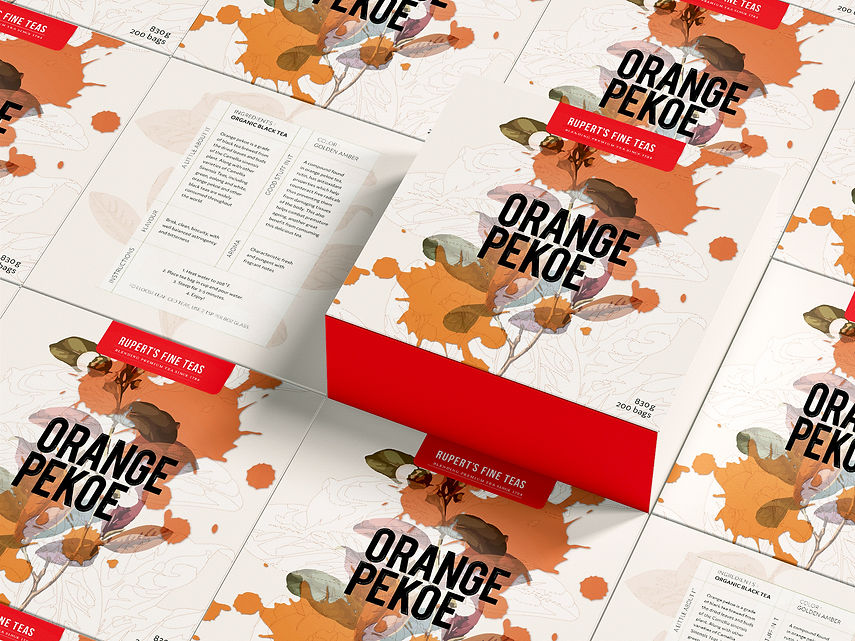
Introducing Rupert's Fine Teas' delightful organic orange pekoe tea, elegantly packaged with a contemporary flair. The design is modern and unique. It features deconstructed graphics of tea leaves that capture the essence of our tea as nature, along with spills of steeped tea at different brewed intensities in glossy textures. This eye-catching packaging is designed to be informative, providing customers with valuable insights and the unique properties and health benefits of our premium tea.
With every brew, you're not just enjoying a cup of tea you're indulging in a visually captivating experience that elevates your tea-drinking ritual. The outside box is organic and natural to the touch. There are layers upon layers of deconstructed tea leaves depicted, from their organic structure outlined in white, reminiscent of old biology books, to the colourful portrayal of the tea leaves, both fresh and dry. All intertwined as graphics, representing a marriage of nature and science.
This is followed by a layer of glossy steeped tea that lies on top of the leaves, a nod to the hierarchy of consumption. This glossy spilt tea is differentiated and enhanced with a glossy effect to catch the light, similar to the way spilt tea reflects light on a counter. This messiness highlights the fun, individual, and experimental process of tea-making, and allowing for different choices in intensities catered to everyone's unique liking.
"Orange Pekoe" is then elegantly styled in an embossed, shiny, and protruding black sans-serif font justified to the left. This subtle choice evokes balance and modernity. The visual chaos in the back is contrasted with this structured and neat alignment. Centre justification would typically be the natural alignment choice for someone, however, in justifying to the left, it gives a subtle nudge toward being avant-garde, forward-thinking, while remaining traditional in ingredients and process.
Lastly, the tea bags inside are individually wrapped and made from organic transparent material in separate envelopes, preserving the tea bags' integrity and flavour. The envelopes portray and evoke dried and crushed tea leaves, like a precursor to the internal tea ingredients that will momentarily be steeped, all in a subtle milky white illustration: thus, a full sensorial experience is created from box to tea, one layer at a time.


Final Designs